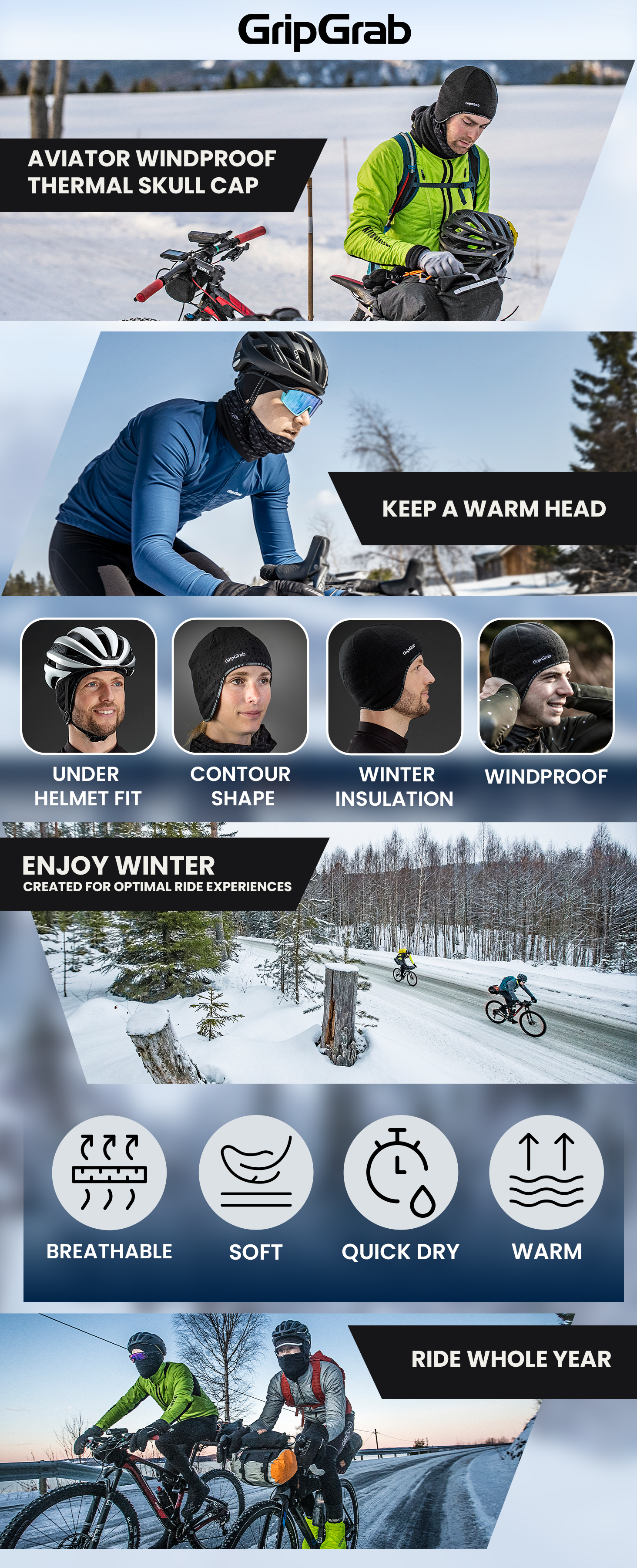
Problem:
The A+ Content lacked a clear structure and consistent visual direction, making it harder to communicate product benefits effectively. Information felt scattered, reducing clarity and brand impact.
Approach:
I focused on creating a structured content flow aligned with how users scan A+ Content - clear sections, strong hierarchy, and benefit-driven visuals that guide attention step by step.
Solution:
I redesigned the content with a consistent visual system, simplified layouts, and emphasized key product features through focused messaging, stronger hierarchy, and cohesive brand styling.
Outcome:
The final result is a more organized and visually consistent A+ Content experience that improves readability, strengthens brand perception, and creates a scalable system for future product pages.